
Overview
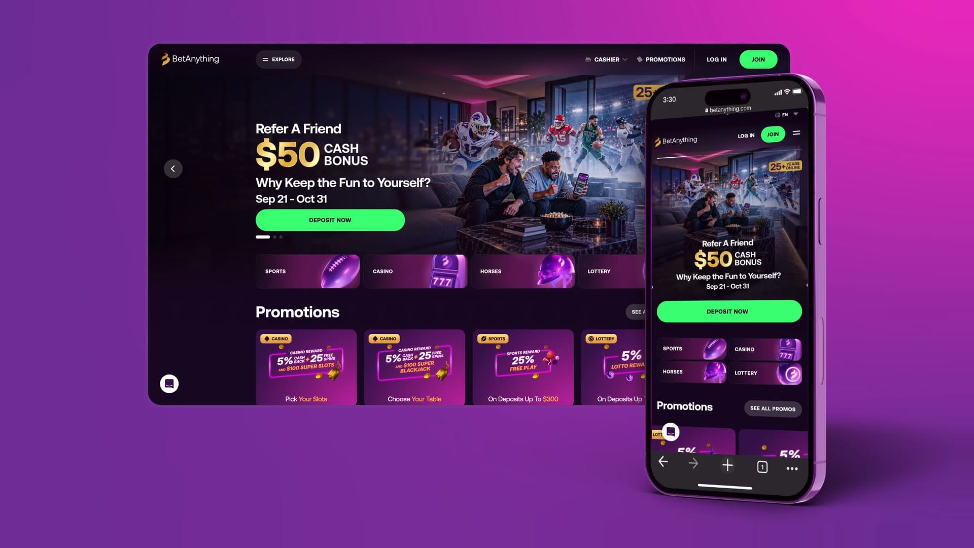
BetAnything's product strategy had been defined entirely by an agency. When the company formed its own UX team, the goal was to move the platform to an experience it owned and could keep evolving, without depending on outside direction.
Challenge
We inherited a complex betting platform with inconsistent interfaces, unclear ownership and almost no documentation. Nobody inside the company had a map of how it worked or why it was built that way, so every new request started from zero and delivery was slow. Engineering had inherited the same gaps, which meant many decisions had to be argued from scratch.
Approach
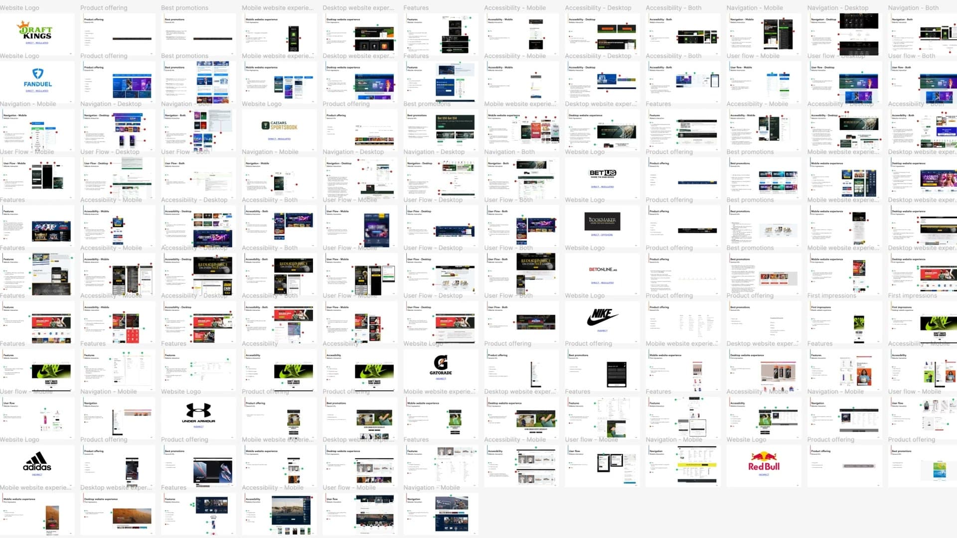
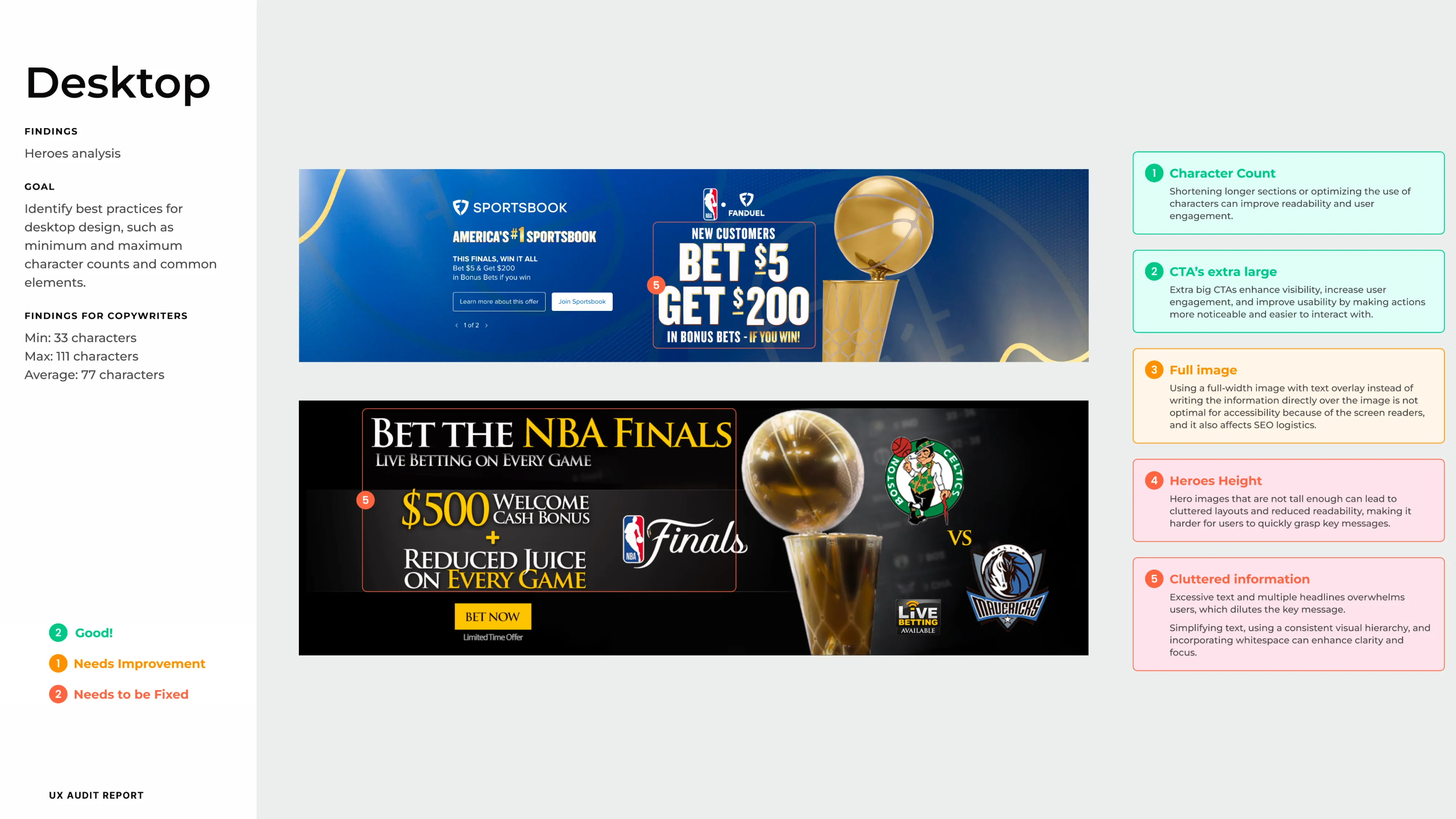
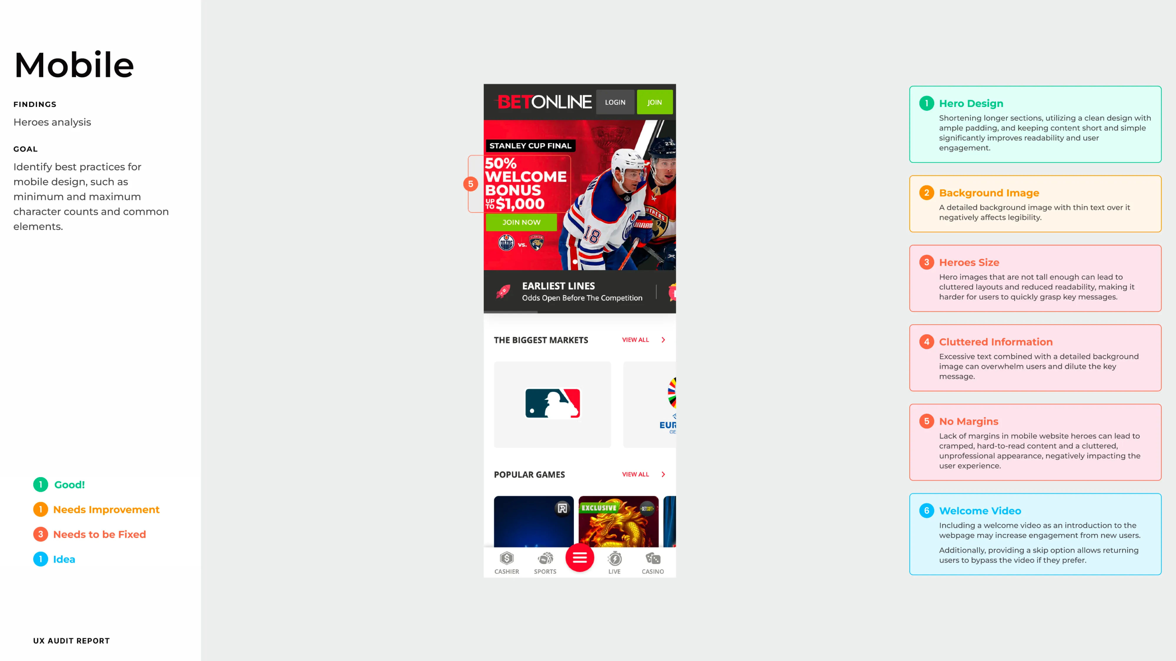
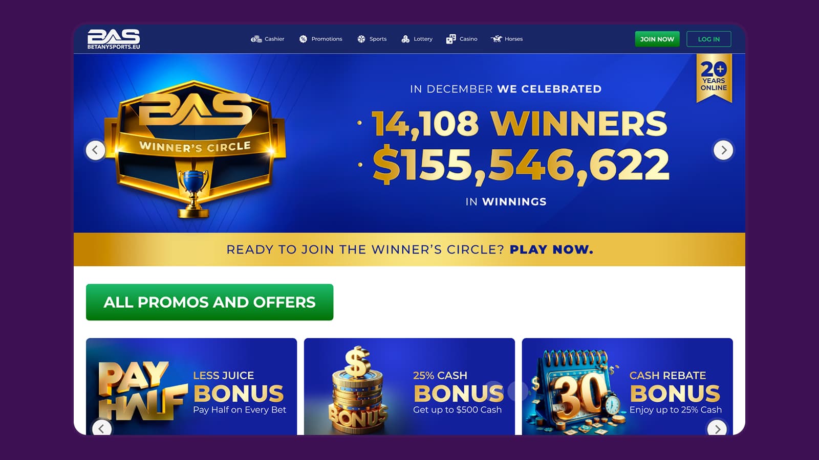
With no internal history to rely on, we started with a competitive audit of other sportsbooks on mobile and desktop, focused on navigation, interaction and usability. The same weaknesses showed up across competitors: journeys that changed between devices, cluttered homepages that slowed down finding information, and limited search. Several of them applied to BetAnything too.
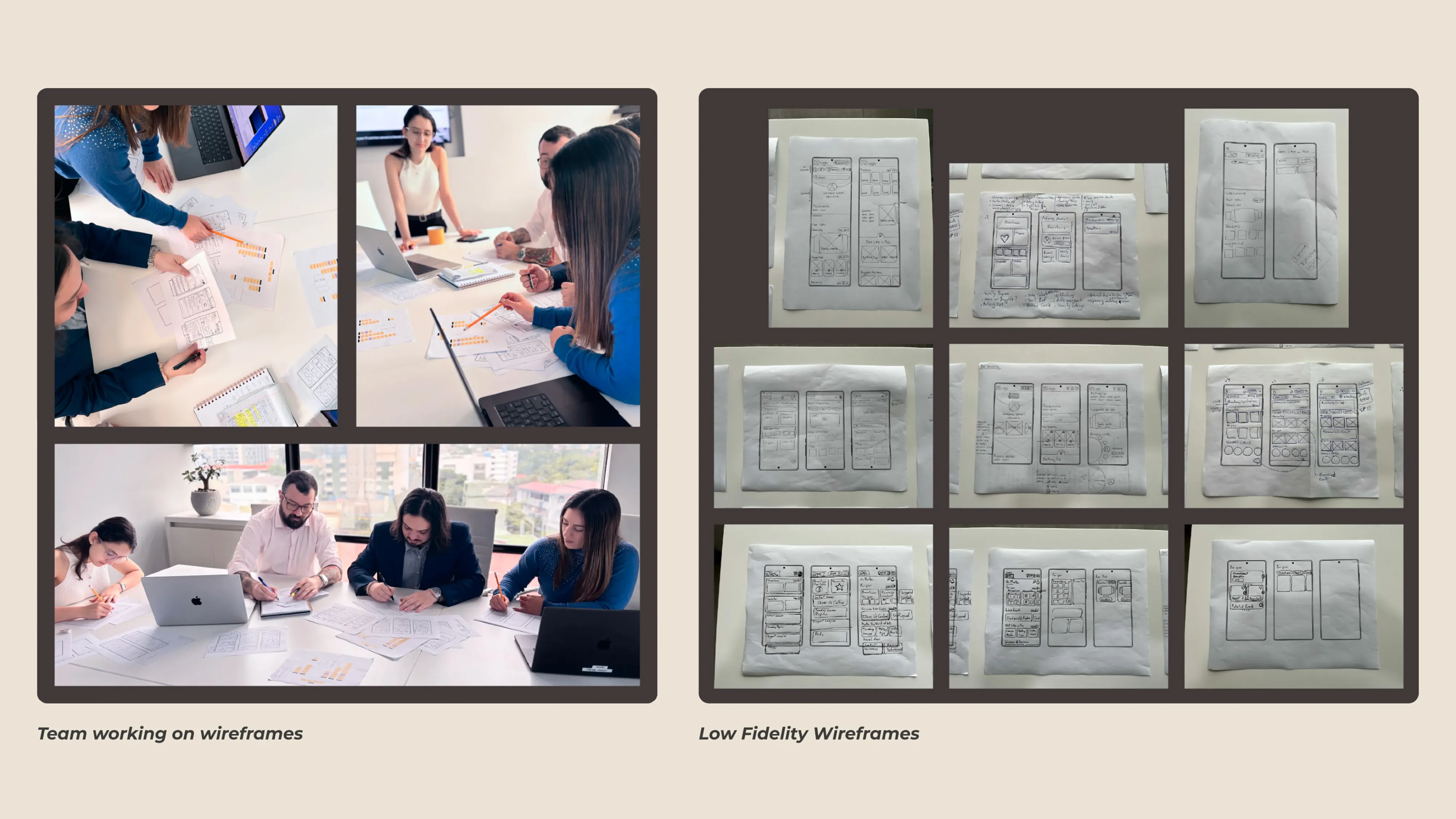
I worked across every phase, from wireframes to usability testing, and we replaced handoffs with workshops and design reviews alongside product, engineering and content.
Key decisions
Structure before screens.
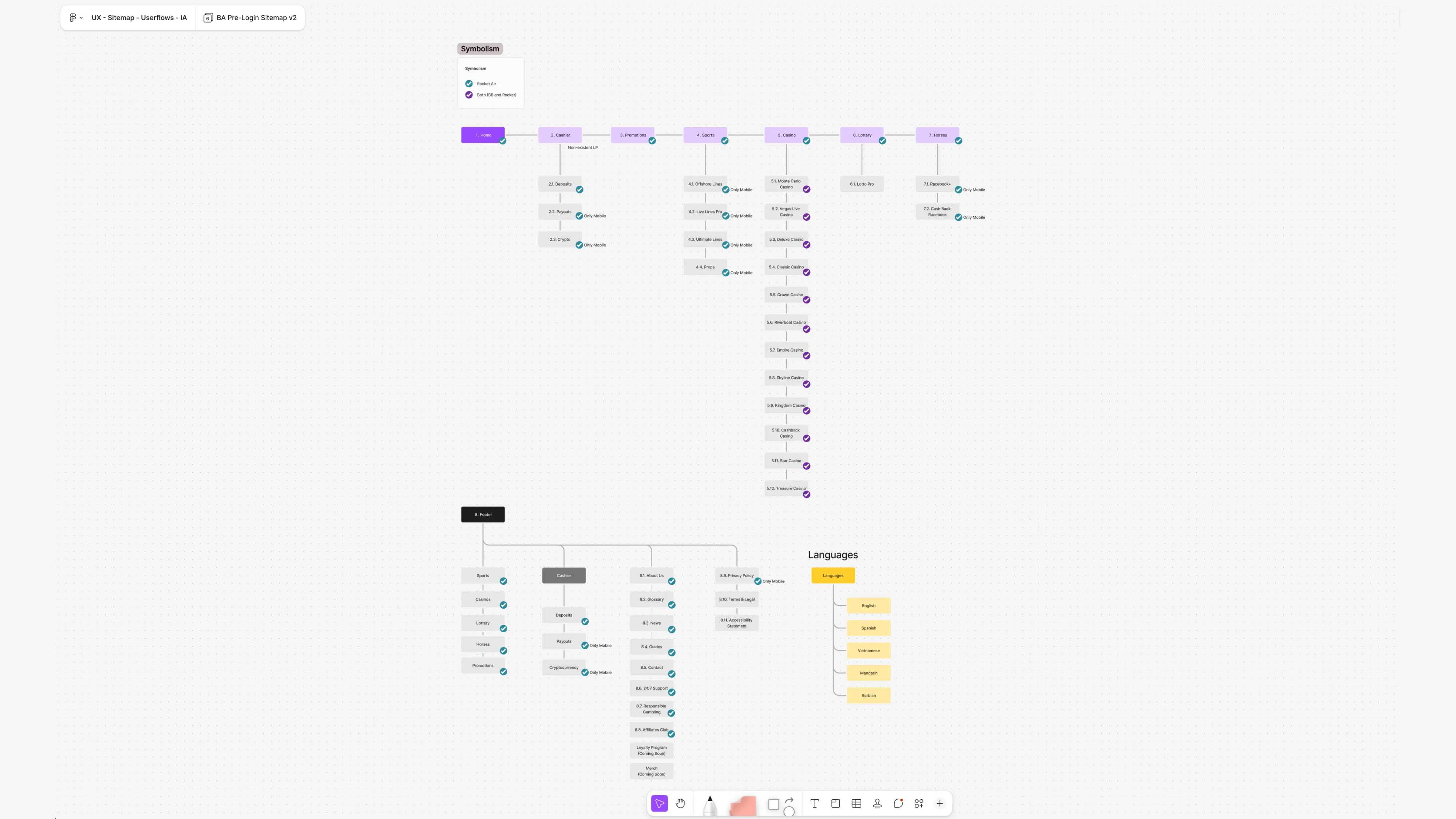
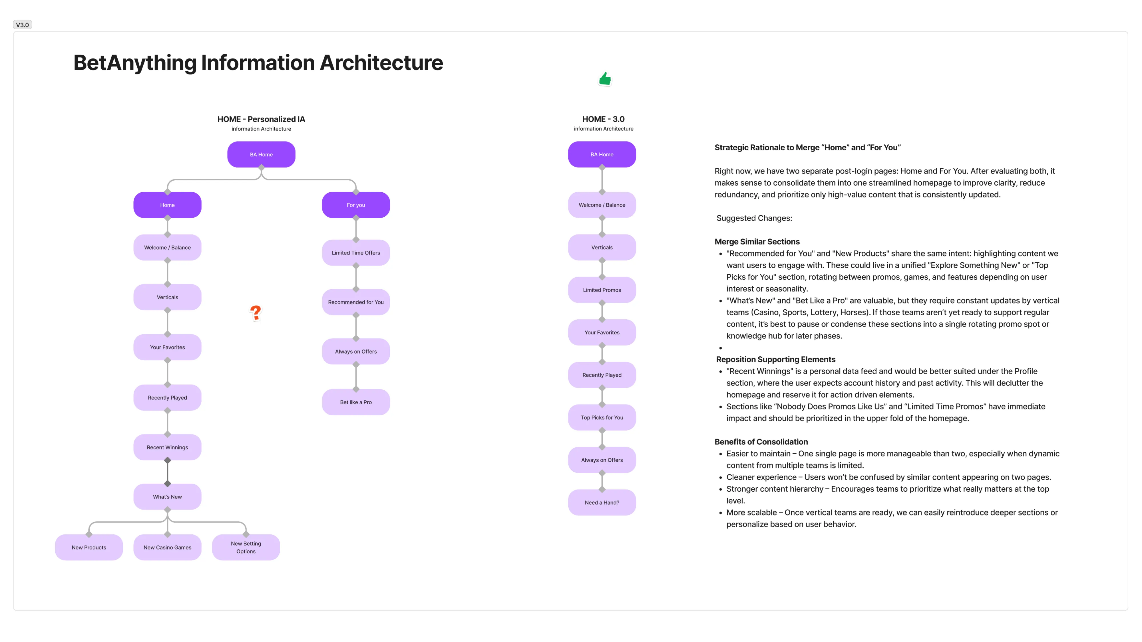
We rebuilt the information architecture from the audit before any visual redesign. Redesigning screens on top of an undocumented structure would have carried the same problems into the new platform.
Controls where users expect them.
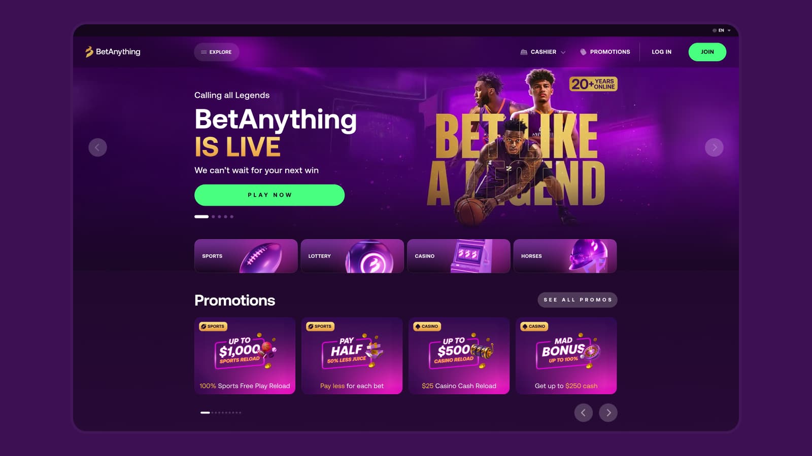
On mobile, we moved the burger menu to the top right and the chat button to the right side, where users are used to finding them on other sites. We also enlarged the primary CTAs in each banner so the main action was easier to spot and tap.
One design system for every area.
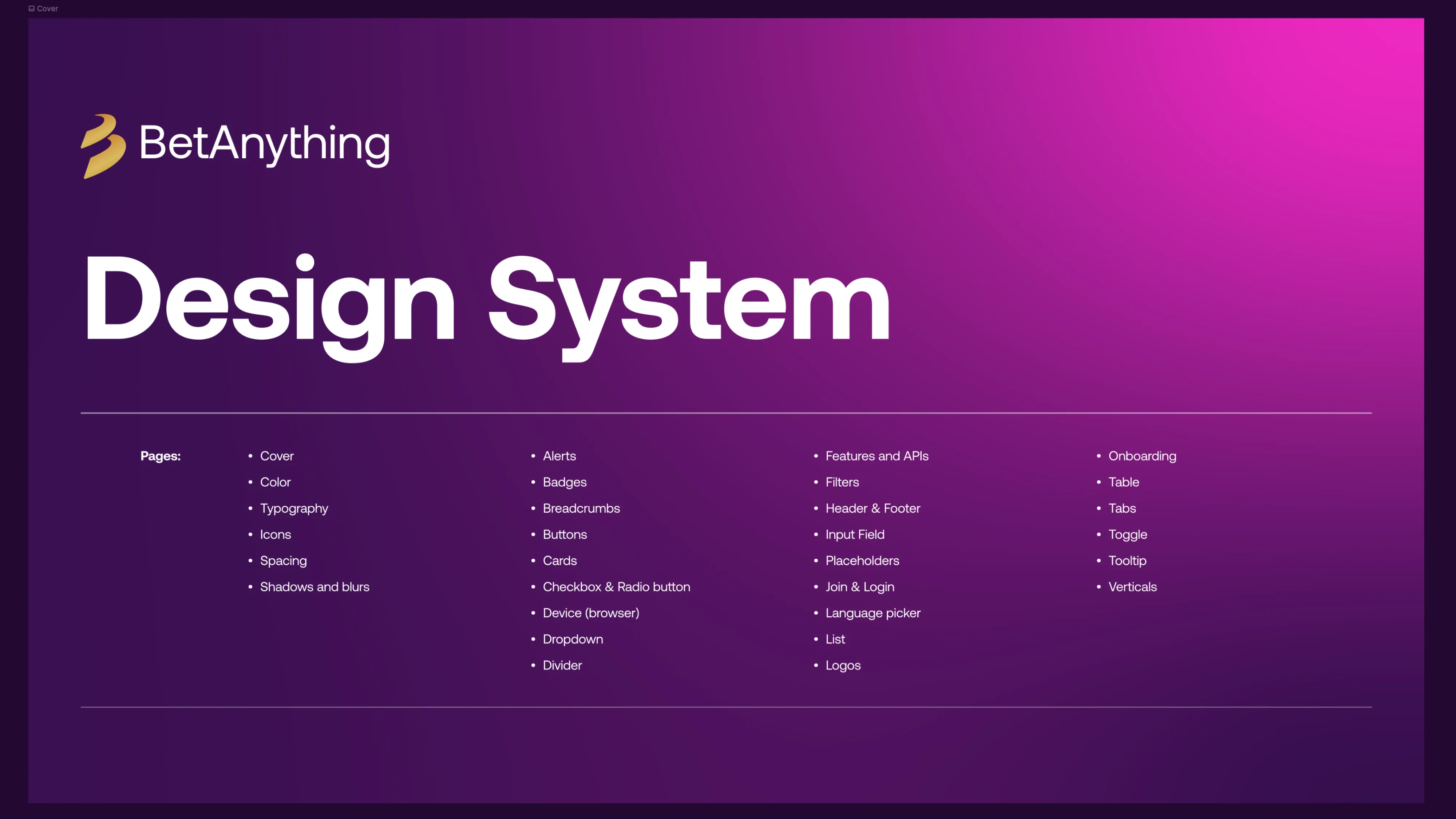
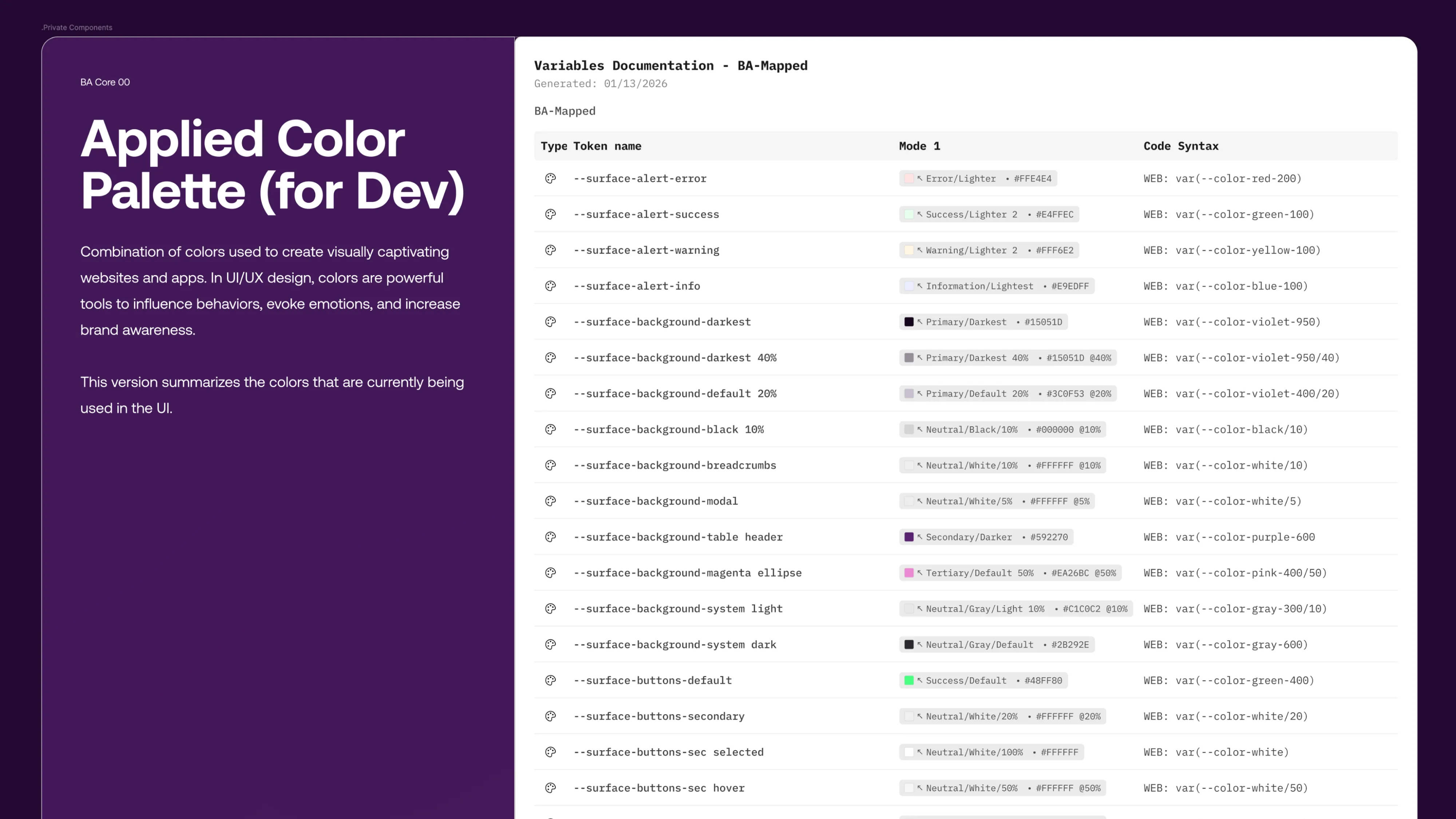
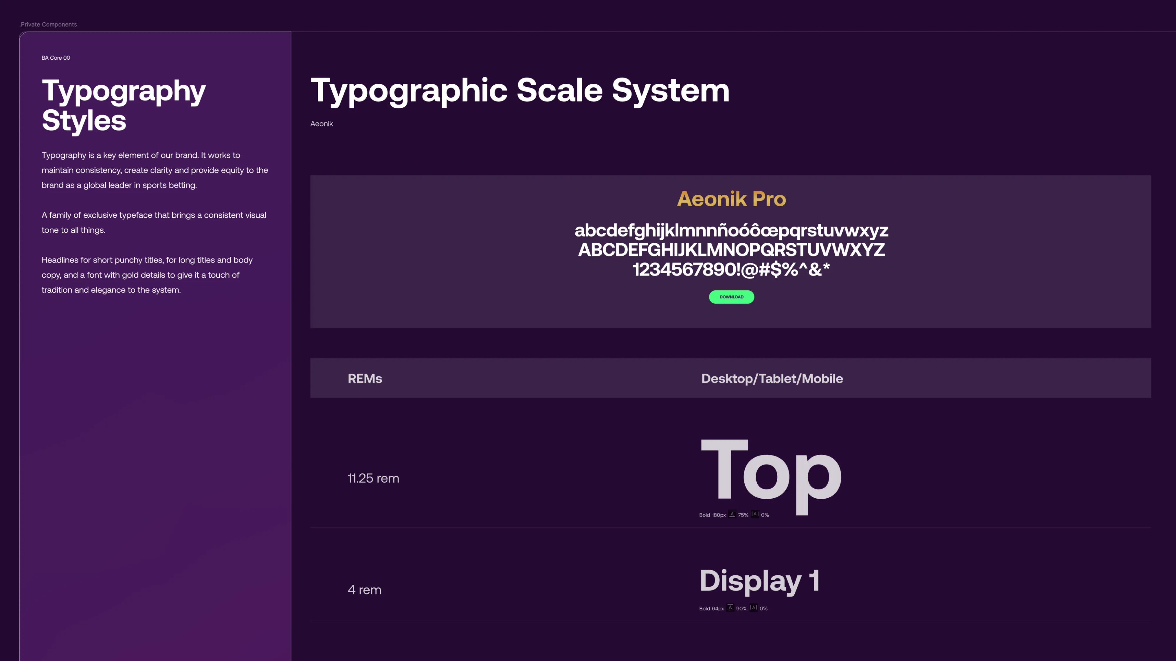
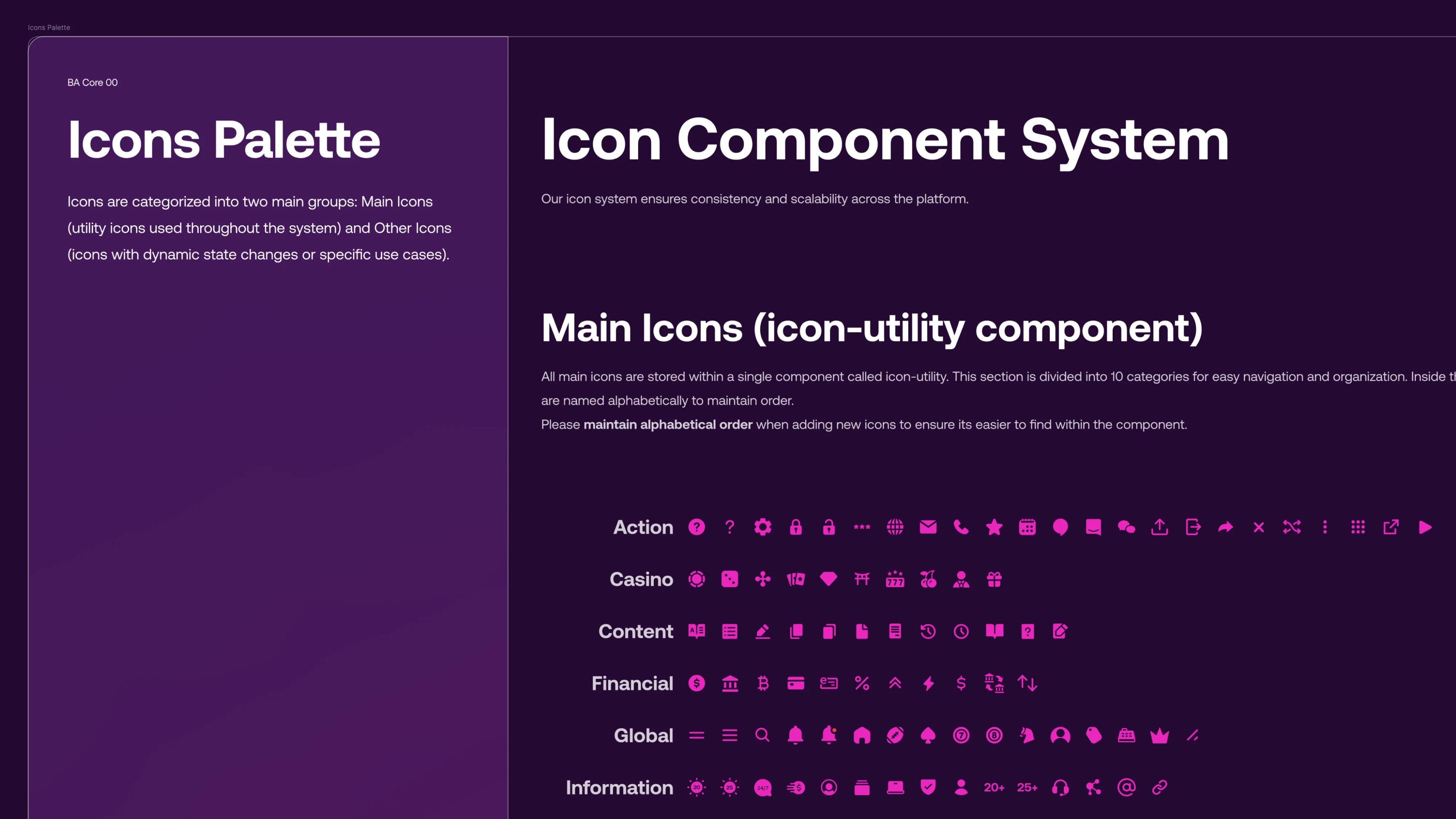
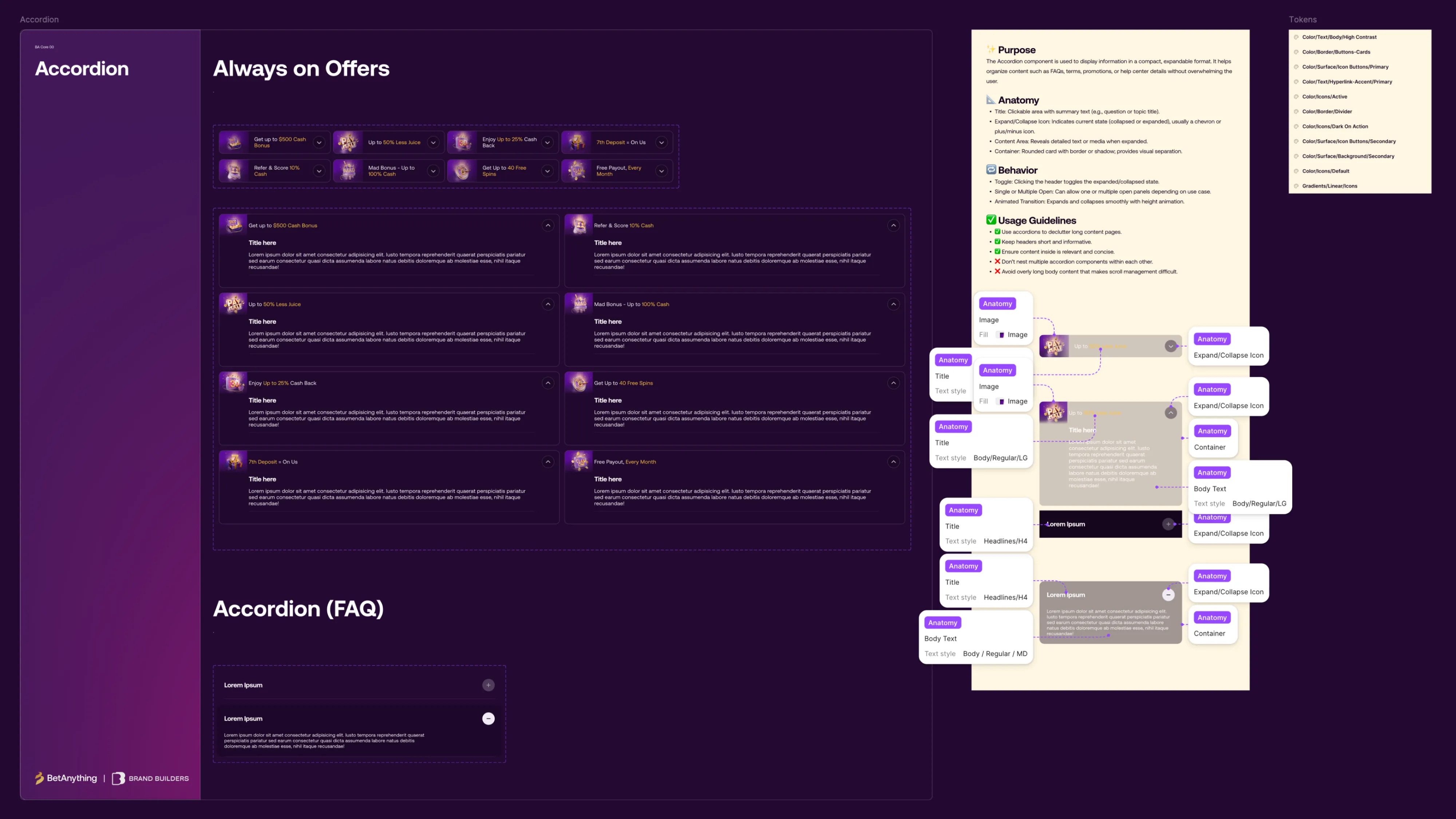
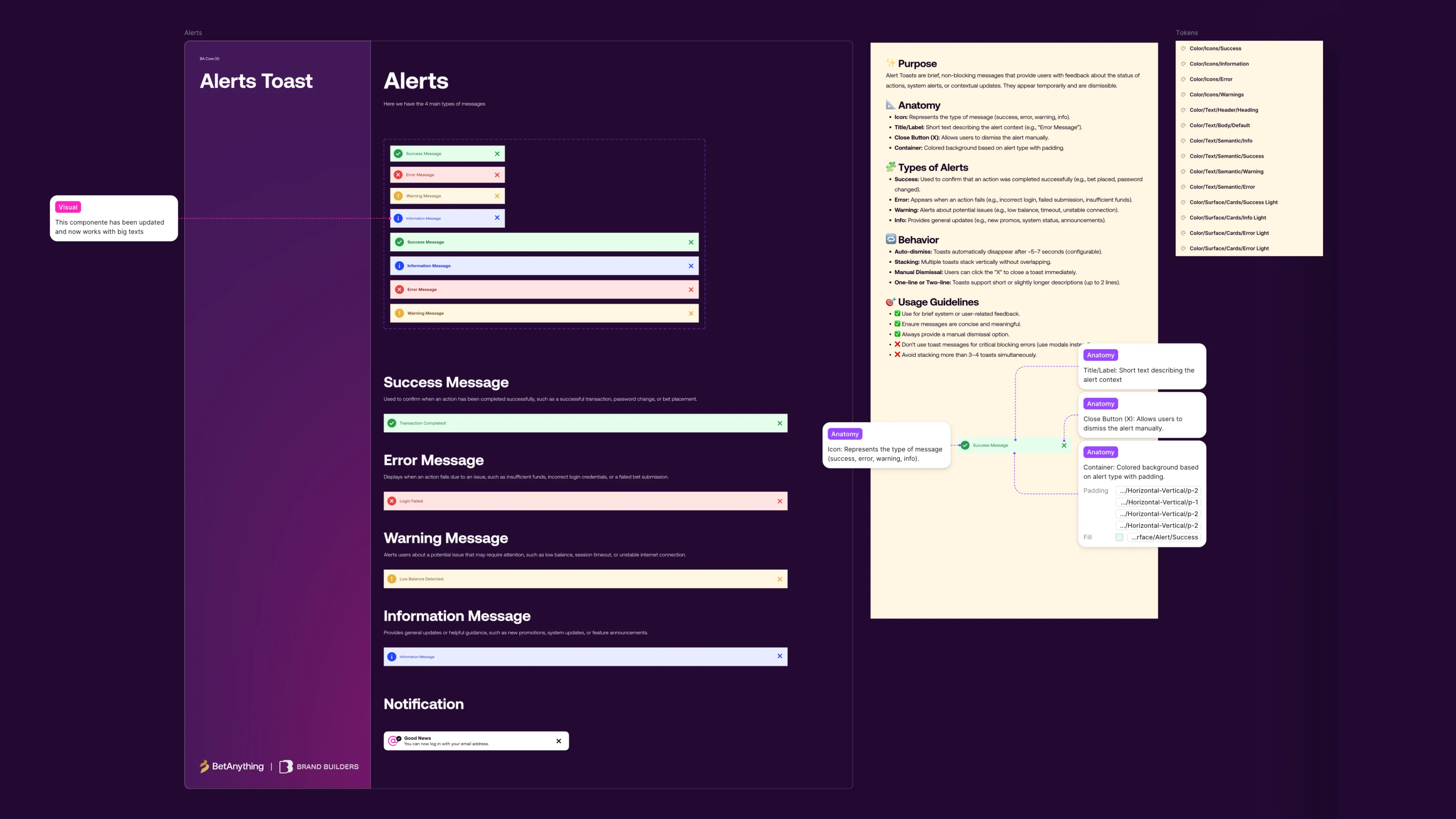
We evolved the design system so every product area pulled from the same components and rules. It addressed the inconsistency left from the agency era and gave engineering one reference instead of one-off specs.
 BeforeAfter
Outcome
The platform relaunched on July 29. On launch day, active users rose to 13K from 9.6K the day before. New users reached 26K. Average engagement time hit 6m 07s, nearly triple the pre-launch baseline.
Through the first week, daily active users held between 9.7K and 10K. After the relaunch, players averaged 250 bets per month. Lifetime value reached $400 per player. Inside the company, UX moved from executing an agency's strategy to owning it.
- Active users
- 13K
- Up from 9.6K the day before
- New users
- 26K
- In a single day
- Average engagement time
- 6:07
- Nearly 3x the pre-launch baseline
Launch day, July 29
What I learned
- 01The hardest part was getting stakeholders on board and aligning with engineering, since neither team had the full picture of the platform.
- 02Since then, I document decisions as I make them so the next person doesn't have to reconstruct them. I also bring more than one version of a solution to reviews, which gives stakeholders something concrete to compare.
- 03If I started again, I would run usability tests earlier and start documenting on day one.
Due to confidentiality agreements, certain details have been modified or omitted.